USING PHOTOSHOP TO CREATE A FUN SYLLABUS: PART 3

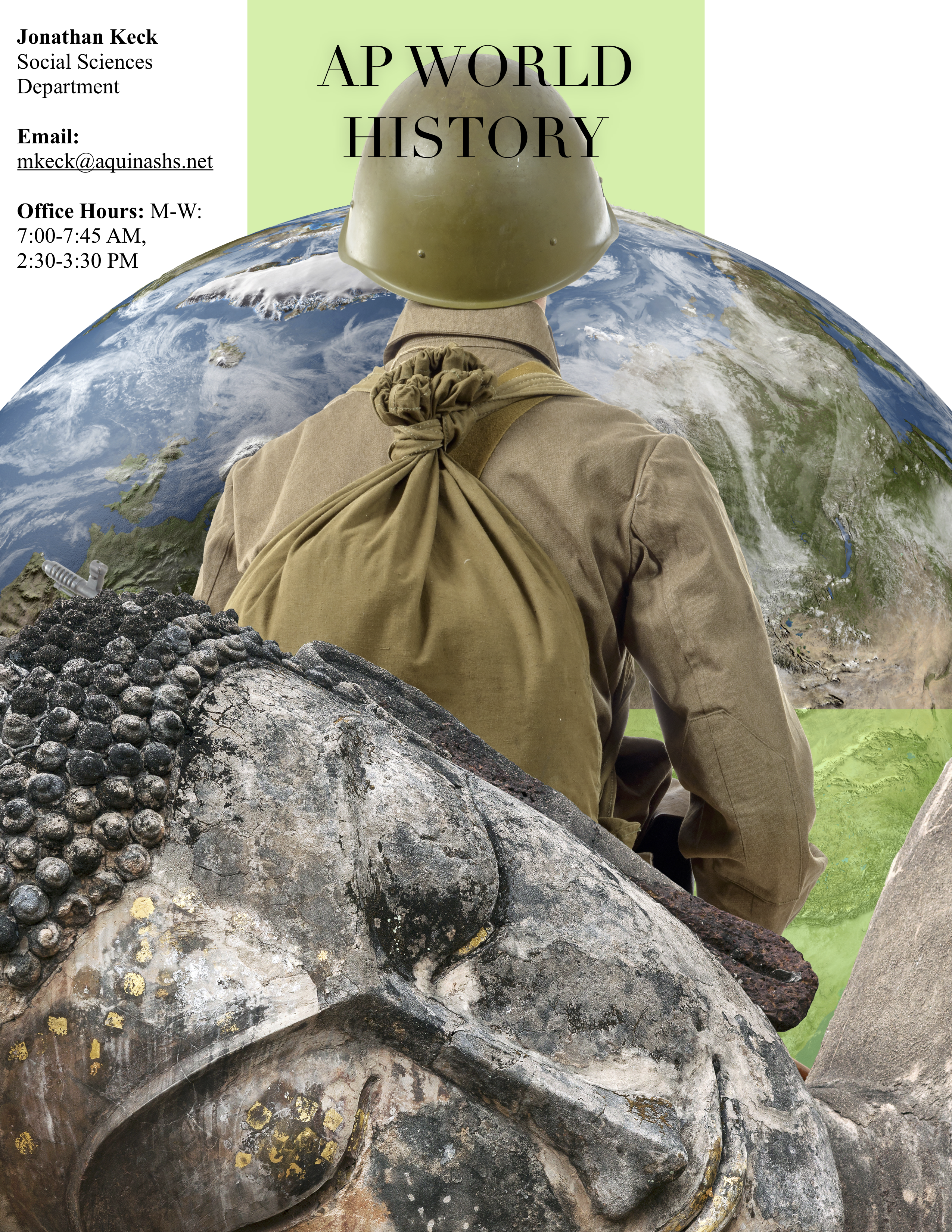
As a goal in just starting out, I wanted to make some creative but straightforward images that could be used for the front pages of my course syllabi.
Below you will see a short video documenting this learning journey and the syllabus cover for AP World History that I created using Photoshop.

All images are from Shutterstock and are personally owned. All images were edited using Adobe Photoshop. The final syllabus was created in Pages. The spoken audio was recorded and edited in GarageBand. The music is from Nicolai Heidlas. The screencast was captured using iShowU. The video and audio were edited using iMovie. The logo and thumbnail were created using Adobe Spark, part of the Adobe suite.

